
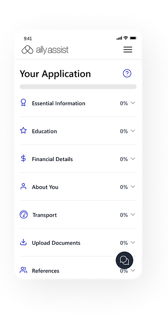
Ally Assist is a service that connects clients with disabilities to Therapy Assistants that best suit their needs across Australia.
I led a team of 10 designers over a 2.5-week sprint to design a high-fidelity mobile prototype with our user at front of mind.
Ally Assist
01
Discover
Problem Statement
Parents feel confused & frustrated when using Ally Assist
to find support for their children with a disability.
They want to complete the sign-up process
but don't have enough time to do so.
Research Methods
63 survey responses
17 one-to-one interviews
10 unmoderated usability tests
03 competitor analyses
02
Define
Affinity Mapping
We synthesized all the data from one-on-one interviews and surveys before grouping together main themes & clusters.
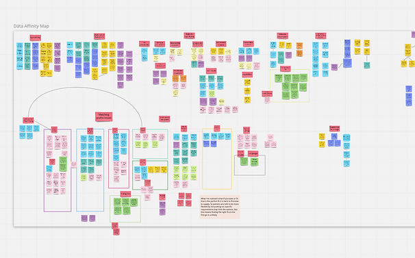
Empathy Mapping
We then reorganized the insights into what people see, hear, say and do.
As the client had 2 main user groups, Parents & Therapy Assistants, we created 2 maps.


Service Blueprint
Besides interviewing Parents and TAs, we also spoke with the Customer Success (CS) Team.
We realized that, though the CS Representatives were not part of the 2 main user groups, they played a pivotal role in the matching of clients with TAs. The current process was slow and very limited in automation and flexibilty.
To better visualise how the 3 parties interact with each other and to identify opportunities, the team created a service blueprint.

User Personas
Haley, a parent, wants to find her son, Thomas, a Therapy Assistant (TA) but is frustrated that:
-
The sign-up process was extremely long and the website was too buggy & complicated to use for someone with little time
-
It's been 2 months and she still hasn't been matched with a TA
Kerry, a TA, wants to gain work experience in OT and is looking for a client to work with. She's frustrated that:
-
She isn't given much information about her clients that would help in building trust and rapport when meeting them for the first time.
-
Clients don't understand the type of therapy she offers and request services that are outside of her remit (eg. grocery shopping, babysitting)


User Journey
Based on our user research, we then mapped out both users' journeys in finding a match.
This helped us to understand what, when, how, and why users undertake certain actions throughout the process. Mapping out touchpoints and fluctuations in emotions at each stage helped to identify potential opportunities to address their pain points.


The Pivot Moment
After synthesizing our data, our research revealed a secondary pain point that the client wasn't aware of and we knew it was something that we couldn't ignore.
The process of matching clients with TAs.
-
After signing up, Parents had no visibility of the matching process.
-
The matching of clients with TAs was completely manual and reliant on the CS Team to process.
-
Matching was based on limited considerations (eg. Location and specialization)
-
Parents wanted to learn more about TAs' personalities and interests to see if they were compatible with their child
-
TAs wanted to find out more about the client before seeing them
So, we structured our Ideation Workshop to tackle 2 'How Might We' statements.
03
Develop
Ideation Workshop
We then facilitated a virtual Ideation Workshop with the co-founders, 2 Haleys, and 2 CS Representatives.
This involved:
-
Introducing the problem statement, user personas, and user journeys
-
Brainstorming & voting for"How Might We" (HMW) statements
-
Crazy 8's to address our HMW
-
Voting on most feasible & desirable features on an MVP Matrix.
How Might We?
"How might we streamline the sign-up process so that Haley can fit it into her busy schedule?"
"How might we make create a confident matching experience for both parents and TAs?"
MVP Matrix
We then collated all the ideas and features from our Ideation Workshop. With the client, we sorted the suggested features into an MVP Matrix based on desirability and feasibility.
The high value and high feasibility features then guided our initial design.

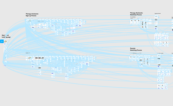
User Flow
We then mapped out what the "ideal" experience would be for both Parents & TAs when interacting with the app through a user flow.
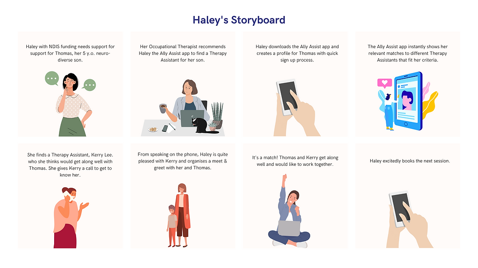
Storyboards
To help visualise an "ideal" experience for both Haley & Kerry, we created 2 storyboards for both personas.


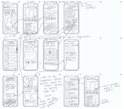
Low Fidelity Wireframe
Then begins the initial rough sketches of the app!
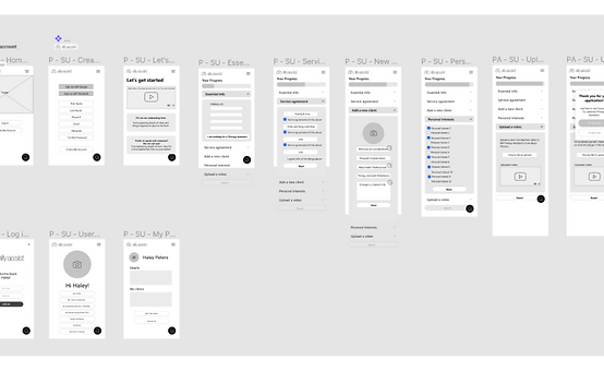
After a few initial usability tests and incorporating the most obvious areas of feedback, we moved on to the med-fi wireframe on Figma.
Medium Fidelity Wireframe
With minimal text, color and use of logos & icons, I designed a med-fi wireframe, incorporating previous feedback.
The grayscale and minimal text left some room for users' imagination throughout usability testing and allowed me to identify obvious changes I needed to make before moving on to high-fidelity prototyping.
After testing with 5 Haley's, 3 Kerry's, and 2 CS Representatives, we incorporated their feedback in our high-fidelity prototype.
04
Deliver
High Fidelity Prototype
After creating a mood board with different app examples, we asked users to compare 3 different designs and realized people preferred more pastel & warmed toned palette. They also preferred something clean, with ample white space, especially with the amount of information they were dealing with.
As the client mentioned they were in the midst of a re-brand, we communicated this feedback to the client and created the high-fidelity prototype with existing brand guidelines.
High Fidelity Prototype
After several rounds of iterations and testing with 4 Haley's, 4 Kerry's, and 2 CS Representatives, the high-fidelity prototype was born!
Main features included:
-
Auto-saved sign-up process
-
Automated profile verification process
-
Customizable profile pages for Parents & TAs (currently non-existent)
-
"Browse profiles" page where Parents & TAs have the newfound flexibility to browse profiles for themselves using filters
-
Ability to propose meeting times with a Parent/ TA (without CS team intervention)
-
Ability to match with a Parent/ TA if both parties have mutual consent to accept the other's request.
But have we answered Haley's pain points?
After each usability test, research participants completed a post-testing survey which allowed us to gather data on whether or not their pain points have been answered by the solution.
Testing this with 4 Haley's, they rated the solution (out of 10):
But have we answered Kerry's pain points?
After each usability test, research participants completed a post-testing survey which allowed us to gather data on whether or not their pain points have been answered by the solution.
Testing this with 4 Kerry's, they rated the solution (out of 10):
8 for ease of use and navigation
9 for providing TAs with more client information
8 in their likeliness to use the solution
8 in their confidence in finding a right match
8 in their confidence prior to meeting a client
8 for ease of use and navigation
9 for a more efficient sign-up process
8 for alleviating information overload
8 for giving Haley more clarity post-application
8 in their confidence of finding the right match
9 in their likeliness to use the solution
Personal
Reflections
I was challenged by:
-
Leading a team of 10 designers
Taking up the team admin and client-facing role, I had the opportunity to sharpen my leadership skills by facilitating productive and efficient stand-ups, motivating the team throughout the process, resolving conflict, and ensuring that everyone felt heard throughout group discussions. Though a team of 10 designers is an unlikely occurrence in the "real world", I'm thankful for this experience! It was quite challenging to ensure that everyone was on the same page at all times. I learned to always keep channels of communication open (eg. posting daily WIPs and slack updates) and to always go back to our data. This helped me to steer the team in the direction of what our users needed whenever we would tangent on personal preferences and opinions. -
Liaising regularly with the client
Aside from the admin and logistics with numerous Zoom calls and meetings, it was challenging but an extremely growing experience being the one to communicate the team's process with clients and keeping them in the loop throughout the design process. -
Realizing a secondary problem
With such a short time frame, our pivot moment was really challenging as we realized that the initial problem was not the only one. This proved to me that problems are never linear and that as a designer, I ought to expect and be open-minded to other pain points that arise from the research process. After all, that's where the fun begins – when we discover a new way that we can bring value and joy to our users!
I enjoyed:
-
Working as a team and how refreshing it was to see so many different perspectives. I was also reminded that my ideas and skills are limited and that group synergy is so powerful!
-
Reaping the fruits of our labour and seeing our users' pure joy and amazement when testing our prototype. It was also so rewarding to see the client so pleased with our work. They mentioned that this was the best experience that they had with Academy Xi yet – from stakeholder management to the quality and the way we delivered the solution!
-
Seeing each member feel valued and proud of their work.
My biggest goal as team lead was to make sure everyone was happy and felt like they were bringing their best work to the table. Though there were some bumps and bruises at the start, we eventually found our groove and worked much more efficiently and productively together. That was very rewarding to see as the team lead!